Project Overview
A website is a user’s first impression of a brand.
One of my strengths as a designer is fully immersing myself in a client’s vision. I enhance their strengths and develop intuitive solutions to maintain their loyal audience while expanding their reach within their target market.
This case study tells the story of how I made my first successful e-commerce website. I hope you enjoy stepping into my design process the same way I enjoyed developing it.
APPENDIX
From ideation to production, view my full design process below.
01 The Opportunity
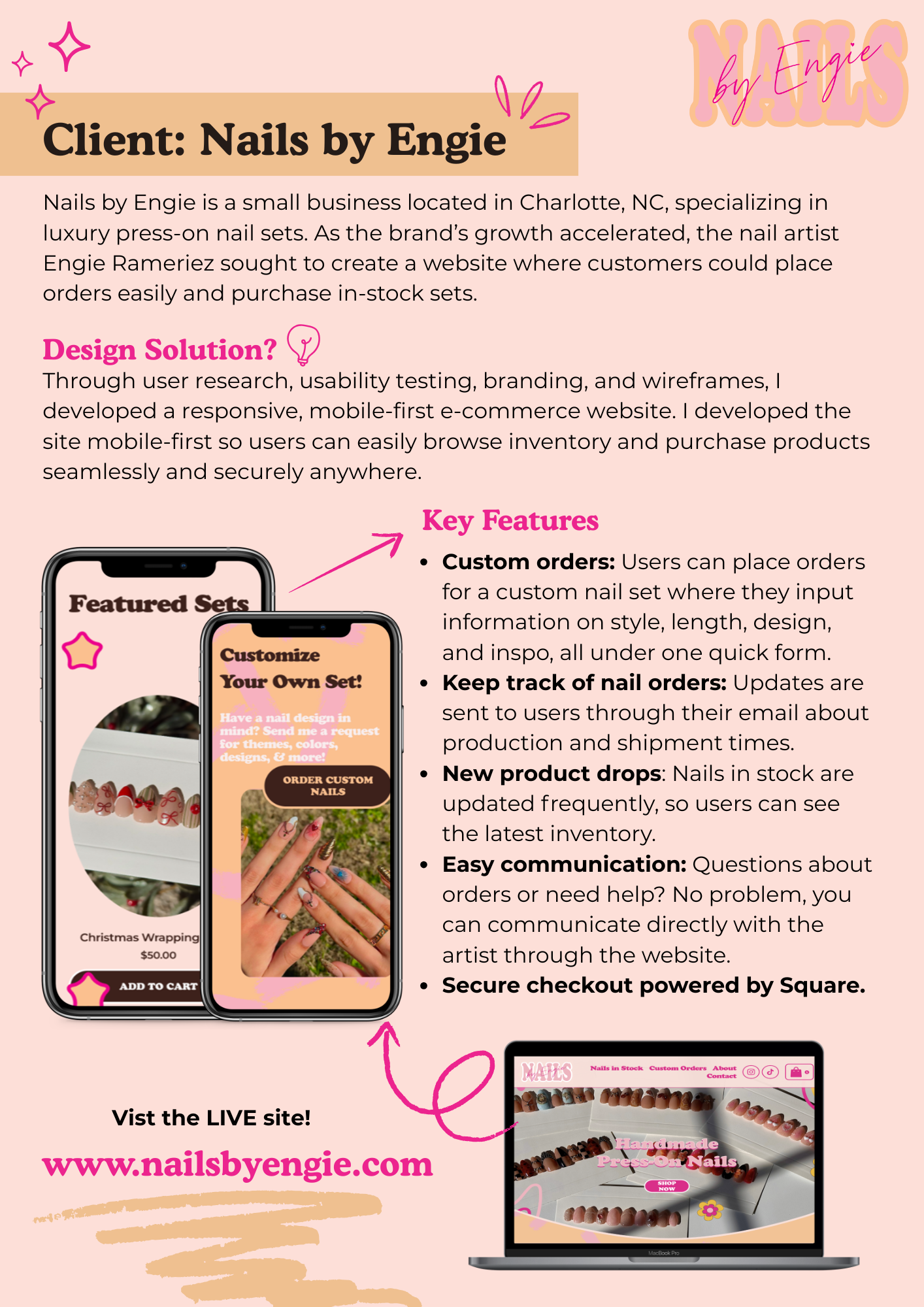
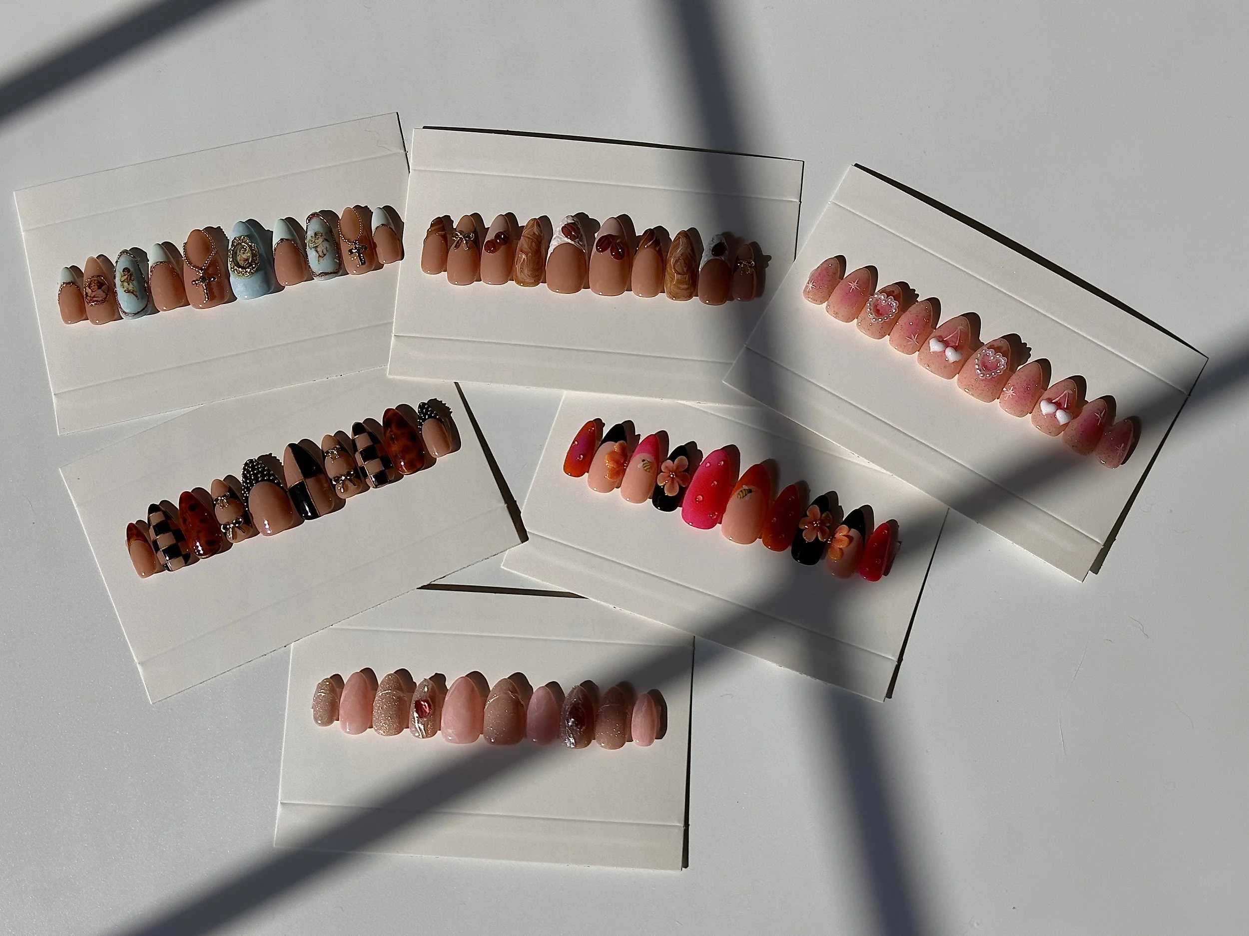
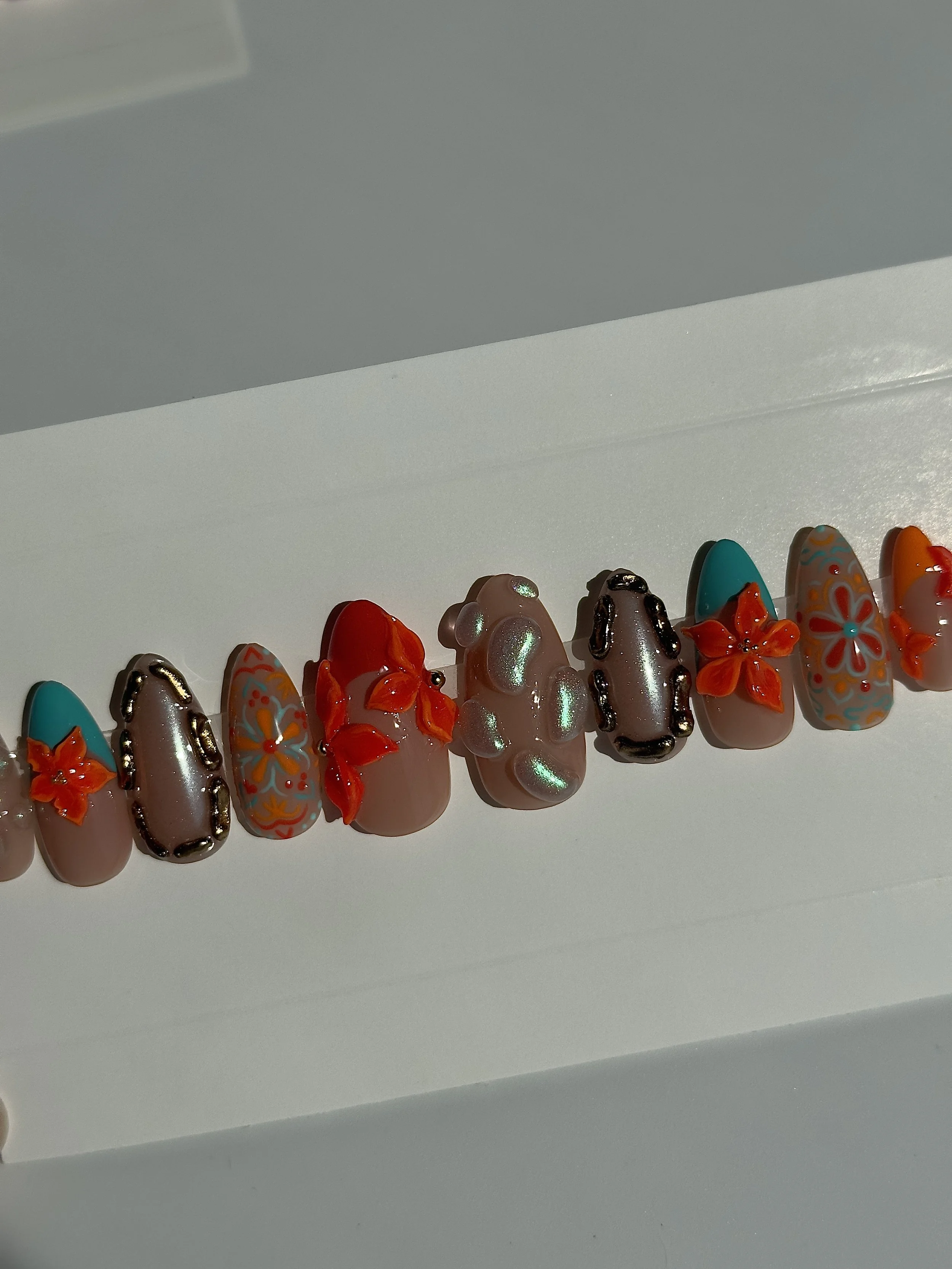
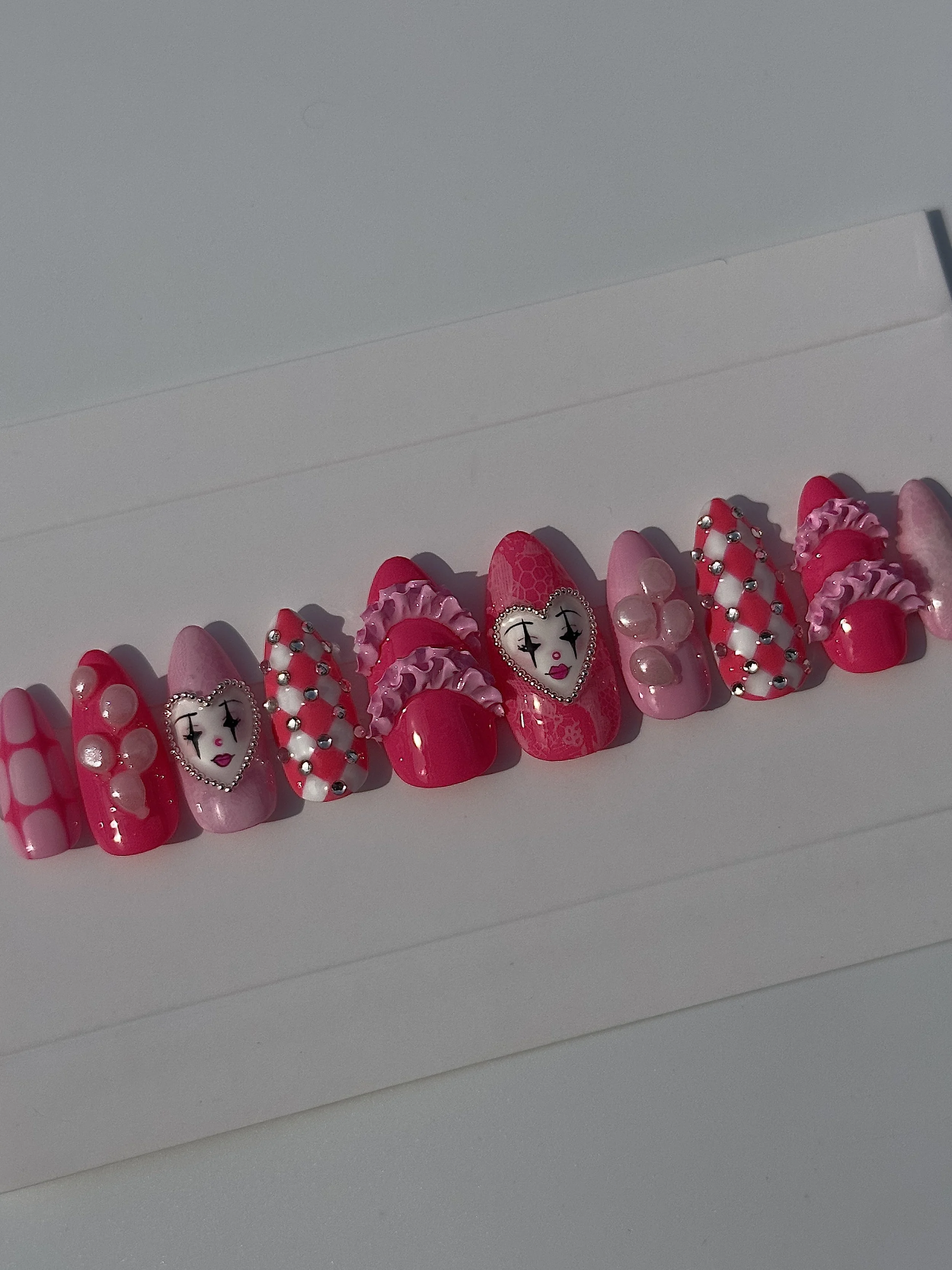
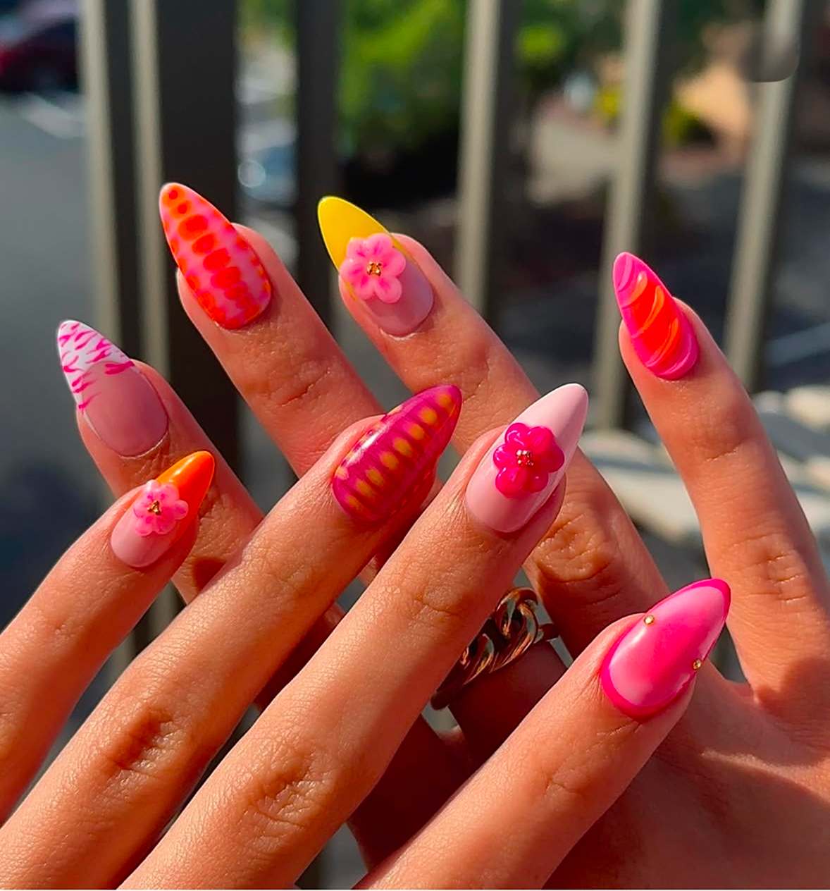
Nails by Engie is a custom, luxury press-on nail service located in Charlotte, NC. Engie Ramirez, the artist and owner has developed and grown the brand for the past two years. As the company continues to grow, Engie wondered how to maintain and keep track of her orders.
As customers were originally purchasing through her Instagram, she was looking for a responsive website for clients to easily purchase her products while maintaining a strong connection with loyal customers. Building off her current branding, vision, and goals, I developed a mobile-first website for her audience.
Developing an e-commerce site involves great attention to detail. We as consumers are constantly purchasing online while wanting products and results right away. By providing a fun, interactive layout and a seamless checkout experience, you fulfill the customer journey.
As the website is now live, Nails by Engie continues to increase customer loyalty, while making an impact in a saturated market.
Visit www.nailsbyengie.com to view the site and discover press-on nail sets!
02 Discovery
Competitor
Analysis
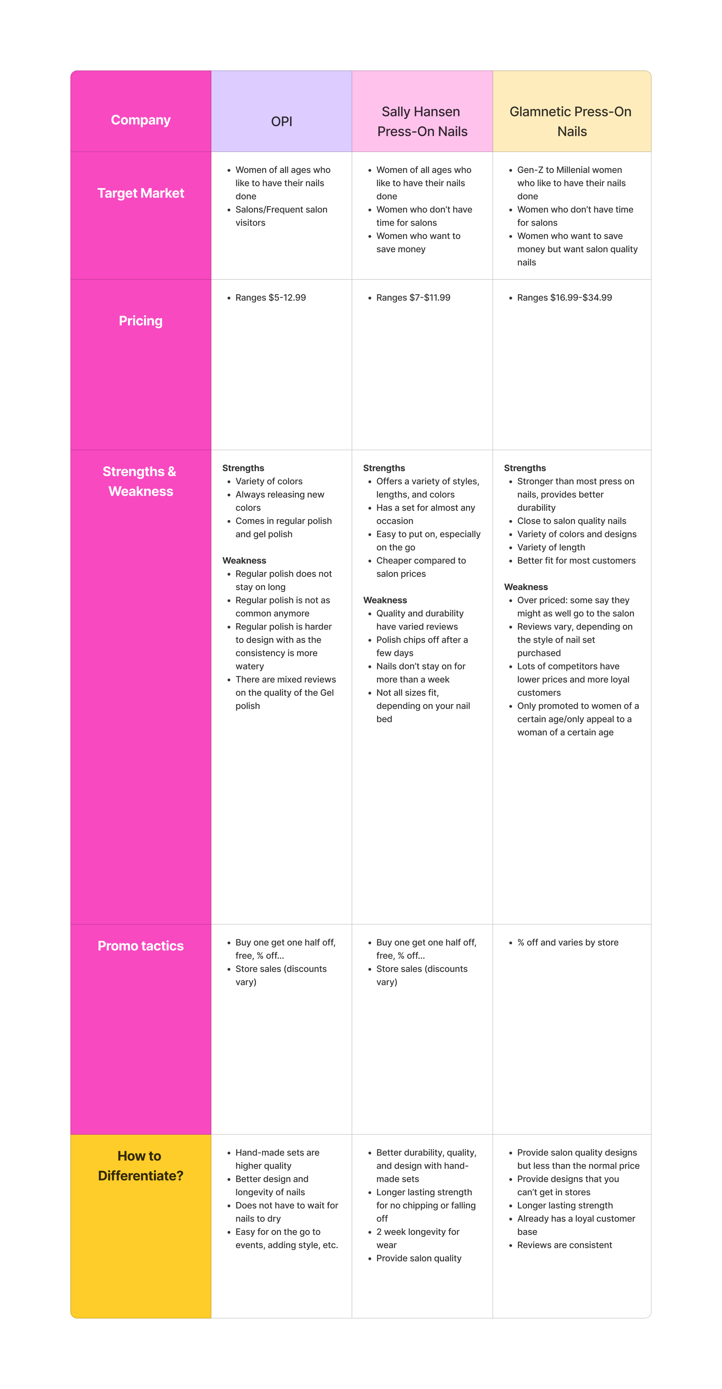
Diving deeper into popular, successful nail brands was important to the development of the website. I wanted to see how they stand out, what gets users to purchase on their website.
It’s important for both established and small businesses to do the research on top competitors. You can gain inspiration from what others do, while finding pain points within the market.
Persona Discovery
"The Busy Professional"
"The Busy Professional"
Persona 1: Miranda

The next step during the discovery process was developing the personas for the brand’s target audience.
Miranda is a young professional living in New York City. With a busy schedule, she barely has time for self-care.
The Pain Point: Beauty upkeep can be expensive in the city. She needs a cheaper alternative to nail and hair salons.
"The Frequent Flyer"
"The Frequent Flyer"

Persona 2:Serena
The second persona is Serena, the entrepreneur who frequently travels.
Serena has a vibrant style and is constantly on camera, so she always makes sure she looks her best.
The Pain Point: Because of her busy schedule, she doesn’t have time to visit a salon. She also wants a nail artist who can make intricate designs.
The goal of this interview was to understand consumer shopping habits when purchasing beauty products online.
User Interview Debrief

The interview involved:
5 women
Frequently purchase beauty products
Frequently get their nails and hair done
Sticks with self-care routine
Audience Shopping Preferences
4 out of 5 participants prefer shopping online for beauty products, whether that's makeup, skin care, nail care, or hair care.
1 out of 5 participants prefers shopping in person, but also shops online
All participants say when they shop online, they shop at Ulta, Sephora, and Amazon. They find those websites trusted for the products they offer and the checkout experience.
Participants prefer platforms where delivery is fast or pick up the next day from store
1 participant shops online through laptop while the rest use mobile browser or apps
4 participants prefer using mobile because it is easier access and they’re always on their phone
Nail Care Preferences
4 out of the 5 participants say it’s easy to keep up with their current nail care routine
1 out of the 5 participants say it’s difficult because of a busy work schedule
2 out of the 5 participants prefer subtle nails, such as nude or pink colors and a shorter almond shape
3 out of the 5 participants regularly use press ons only
2 participants like using press ons for special occasions
2 out of the 5 participants enjoy the process of getting your nails done at the salon
The participants that preferred press ons enjoy how easy it is to apply the nails, it’s quicker compared to getting nails done at the salon, it’s cheaper than salon prices- especially for certain shapes, lengths, and designs
Online Shopping Barriers
Participants say they have experienced problems when purchasing products online because the images or explanations don’t match the quality in person
Sometimes it’s hard to tell colors or sizing of products
Late delivery times, many want the “instant gratification”
Difficult checkout process
Insights & Results
The results helped understand what audience the brand should target, as well as decide the different styles or themes of nails for the pages of the website. It was insightful to understand why participants prefer shopping through mobile instead of a laptop and what they look for when shopping for new products. Participants recommended to look at Doelashes and the target app as inspiration of imagery and organization of products.
The next steps involve conducting research synthesis to map out the user journey and creating an empathy map to better understand how to build a compatible site for the target audience.

03
Low Fidelity Wireframes
Developing low-fidelity and high-fidelity wireframes was integral to bringing the branding to life. The goal was to create a familiar, seamless checkout experience for customers similar to other e-commerce sites. I wanted users to feel comfortable throughout the process and ensure their payments are secure.
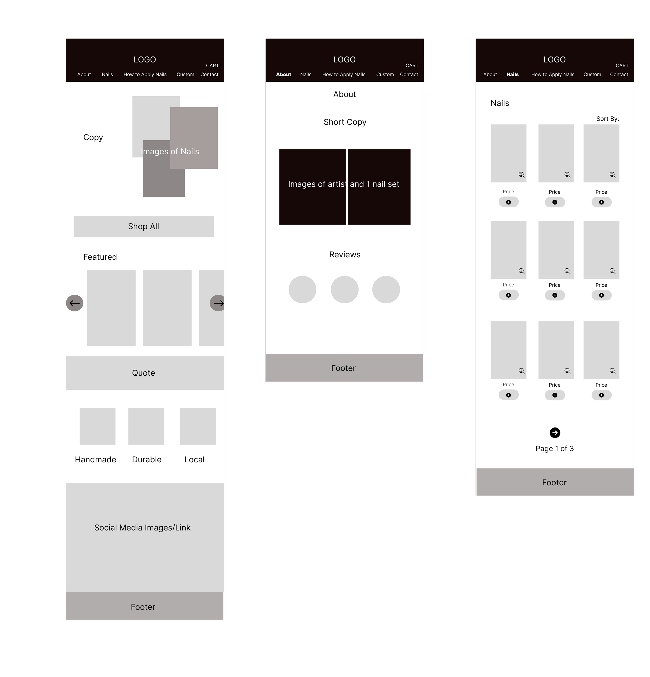
These wireframes showcase what the home page, about page, and current nails in stock would appear.
The home page involves utilizing a lot of product imagery as well as descriptions of the quality of the nail sets.
The about section provides a brief summary of the nail artist’s background, and three reviews from previous clients

The nail product page showcases in-stock nail sets where users can scroll through pages and zoom in on product images.
Custom orders are a huge part of the business. This flow involves inputing the custom order request and the checkout process
04
Visual Identity

Branding

Logo Development
Sketches

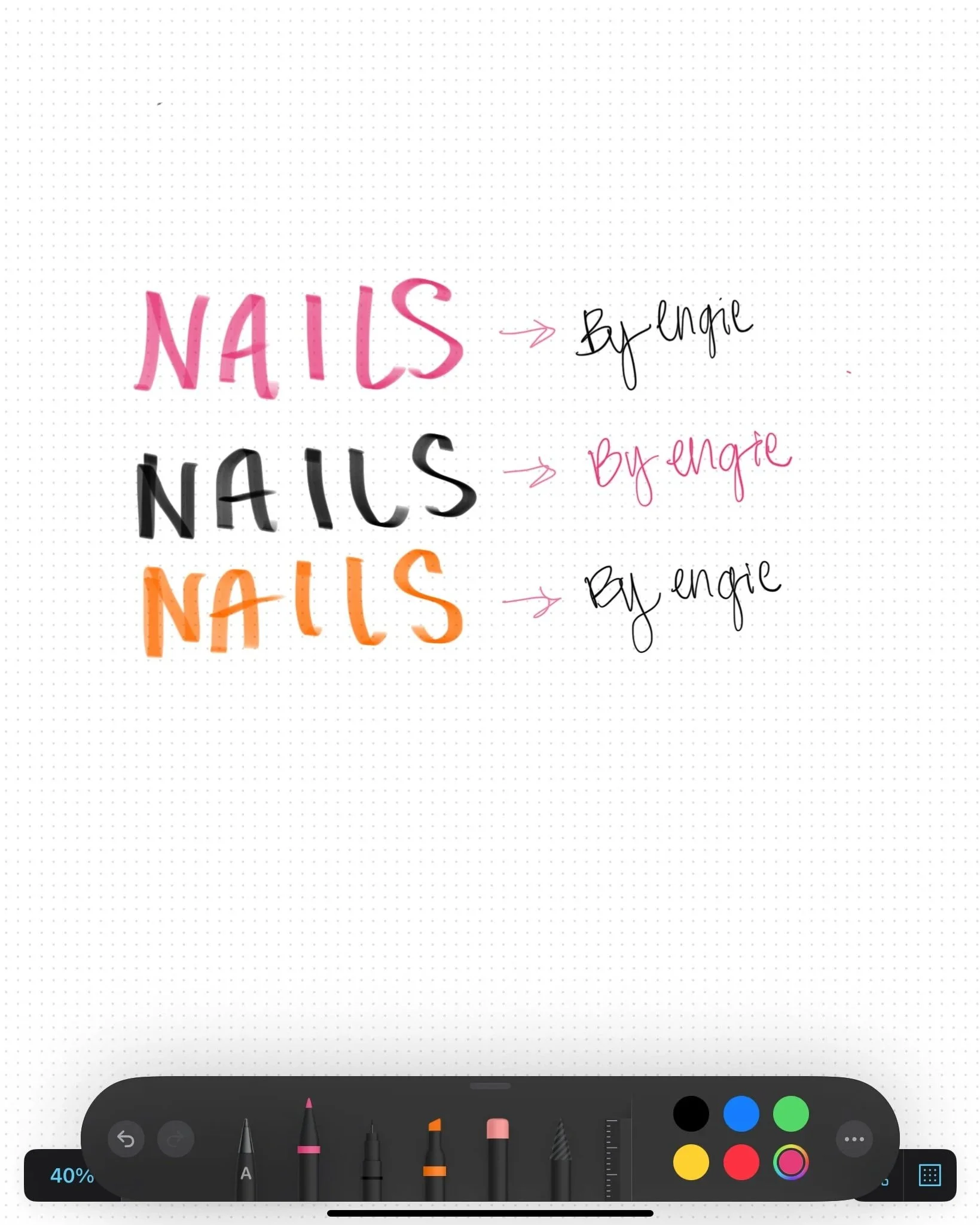
Developing the logo included having the word “nails” bold and uppercase to convey a feeling to the user.
I wanted the logo to be recognized by the pop of color and type of typography.
Including her signature provided a personal touch. Her branding is very girly and colorful, and by including the signature, it pulls it all together.
Inspiration
Final Logo
Concept
I chose these colors because she wanted her brand to come off as playful and bold. This palette can be found similar to sunsets or summer-related images.
The welcoming branding allows users to be enticed while providing a feeling of “warmth”. Many nail brands have simple, minimalist branding, so I wanted to make Engie’s stand out and memorable.
05
High Fidelity Wireframes
Combining the low-fidelity flows and branding, the final wireframes came together. During this process, more flows were developed as I thought about what the user would look for when trying to gain trust with a new nail service.
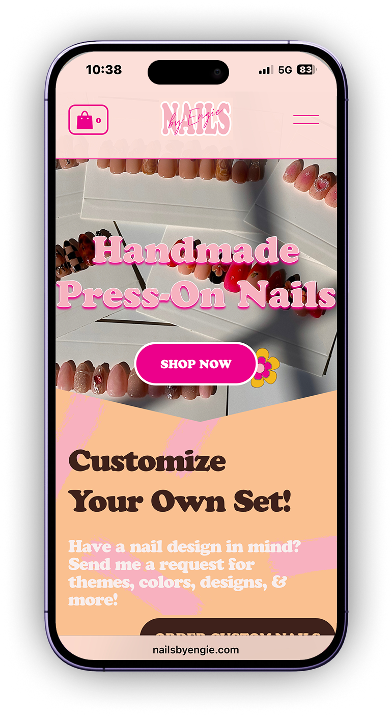
Nail Product Page
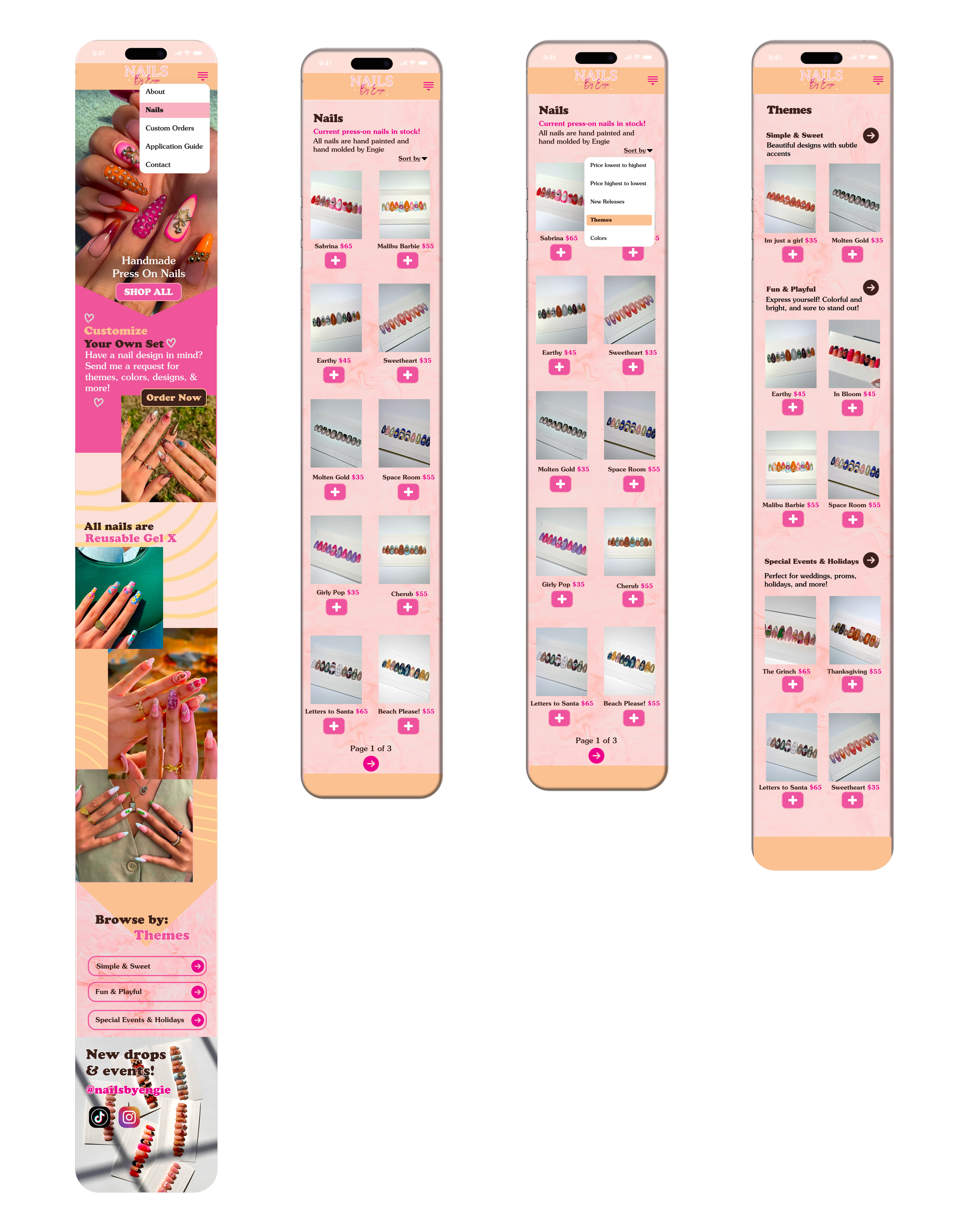
Starting from the navigation on the top right corner, users can easily browse through pages of available nail sets in stock. Users can sort the nails by price, new releases, themes, and colors. This provides organization, an easier search, and a way for users not to get overwhelmed by the amount of products offered.
Final prototype!

Custom Orders
Custom orders are the most popular user purchase
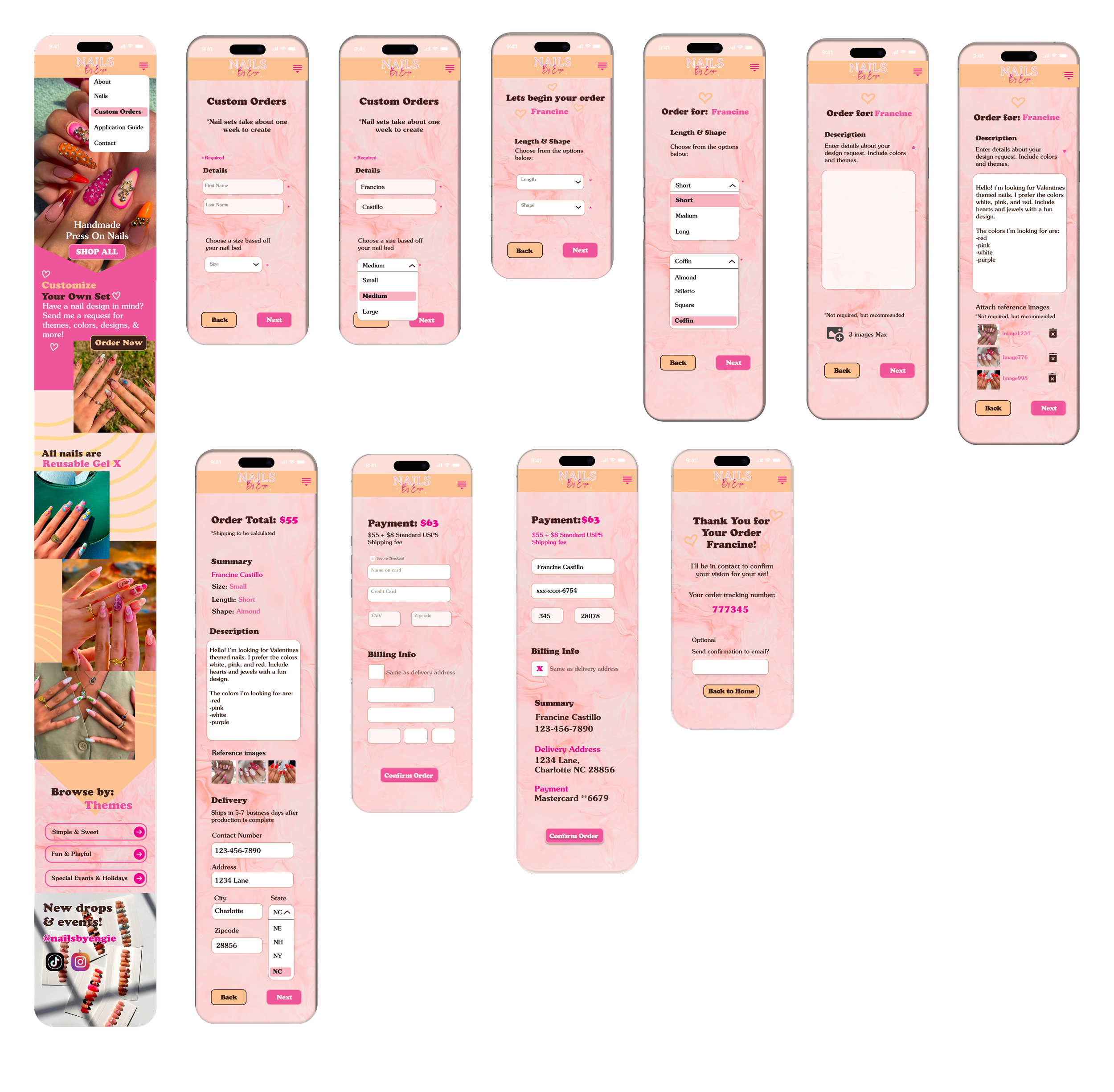
In order to make the checkout process as seamless as possible, questions were detailed yet short enough for the user to read and answer.
Providing drop-down options allows users to get the broad picture of what the artist is currently offering. By adding and requiring inspo images, users are able to add the imagery that provides accurate descriptions of what design they want. This allows less design misunderstandings to happen.
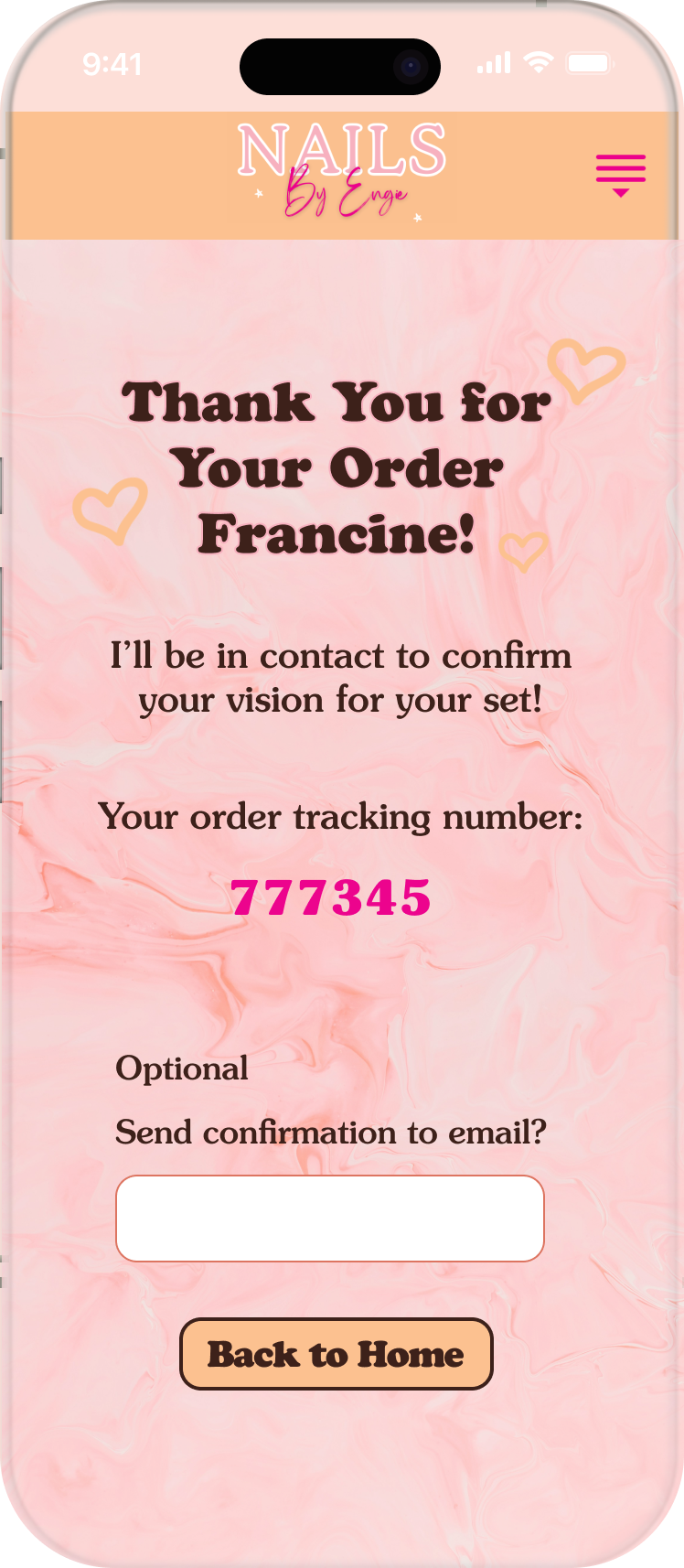
Checkout is secure and provides a confirmation number and email to the user’s contact information entered.
Final prototype!

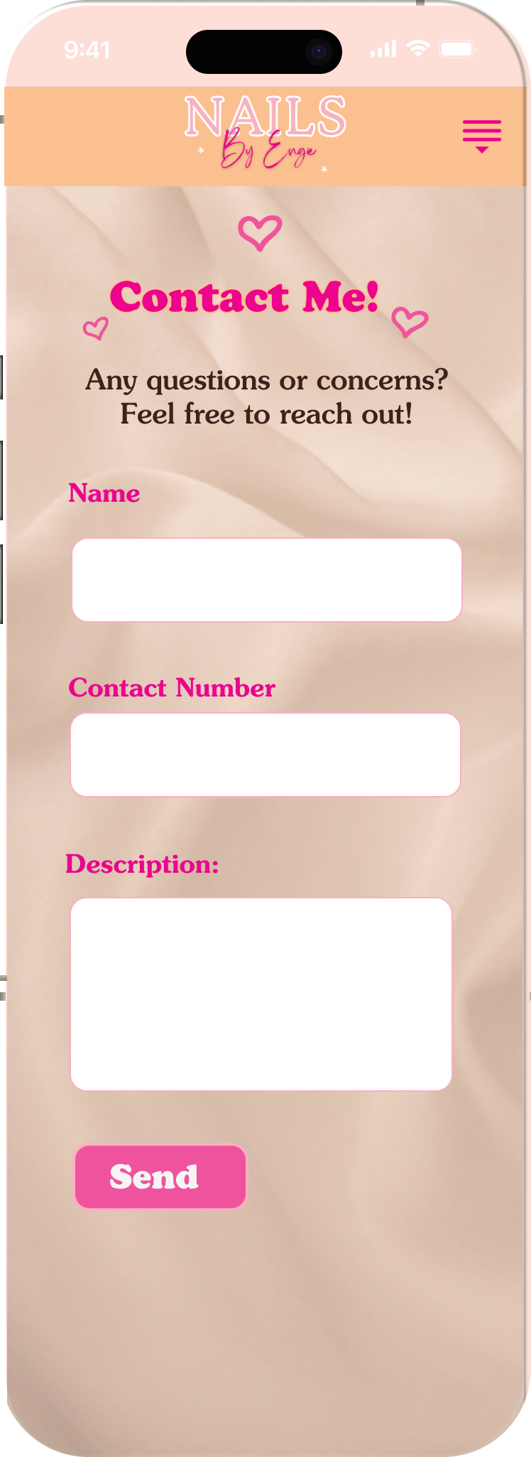
Contact Me
For any questions or more order inquires, users can contact the nail artist and be sure to get a response within 1-2 business days. This makes communication between the cient a lot easier compared to messaging over Instagram.
Final prototype!
About Me

If users want to learn more about the artist, navigating to the about page is where users can find her background and verified reviews from current clients. This allows users to get to know her style and personality better, while gaining trust by reading good reviews of her products.
Final prototype!

06
Usability Test Results
The goal of this test was to understand how users navigate the site and identify any confusion or roadblocks they encounter when placing a custom order, navigating product pages, contacting the artist, and browsing the about page.
Key Findings & Feedback
Creating a Custom Order
Users had little to no difficulty navigating the page
Users found the checkout process easy and familiar
One user suggests showcasing a “secure checkout” by an icon or additional copy when the user is entering payment information
Navigate the About Page
Users had little to no difficulty navigating the page
Users found the information clear and trustworthy
Sorting the Nail Product Page
Users had little to no difficulty navigating the page
One user suggests making the logo clickable to direct users back to the homepage
All users stated the copy was clear
Contact the Artist
Users had little to no difficulty navigating the page
Users found the questions clear and concise
The usability test results assisted in polishing the final look of the website. Further editing imagery and navigation, I began to upload the frames to Squarespace.
The feedback from users was fantastic as all users loved the look and theme of the website. Getting honest feedback is important, as I found the user’s needs were met throughout the process.
When inputting into Squarespace, I had to edit some of the original buttons and layout of the home page according to the Squarespace layout guidelines.
Next Steps
The Final Prototype

Click the phone to visit the live website!
Conclusion


Utilizing Squarespace, I brought the artist’s vision to life after finalizing the high-fidelity wireframes. Building the site did come with roadblocks. Squarespace has some design restrictions, so I had to adjust the look of buttons and some imagery. Although the final website isn’t the same as what I planned, the branding remains the same.
As I revealed the final site, I received fantastic feedback from users. All users said they understood the brand with its fun designs and bubbly personality. This evoked interest in new users as the branding is welcoming, colorful, and modern.
Current website highlights
Since the launch of the website, there have been 710 unique visitors and a total of 1.3K views
600 of the total views were by direct search
450 users navigated the site on mobile

How This Impacted My Design Process
Developing my first live e-commerce site was very rewarding, and I am proud of what I have accomplished.
This project allowed me to use my creativity incorporate marketing degree. I realized how powerful it is to pair my digital strategy knowledge and UX design skills. I see the impact of in-depth research of competitors and the industry, while translating a new brand’s strengths in a saturated market.
I developed a better “eye” not only for design, but also the capability to fully see the user and how I can provide them what they need.